Showing posts with label design. Show all posts

Thursday, December 16, 2010

another info design project!

How to Throw a Frisbee Properly: Poster. Fall 2010.

Project Requirements: Illustrate a how-to using human subjects.

  • Include at least 10-15 photos that have been rendered from their original forms. 
  • 3 PMS Colors + Black
  • A timeline showing the history of the subject you choose
  • A brief paragraph explaining the subject of the poster
  • Steps written to explain the how-to
  • Sources and team members listed on poster

Marguerite was one of my team members on this project! Go to her Flickr page to see other projects she’s worked on!

how to frisbee with timeline

(click to enlarge)

find this project on flickr | behance

Thursday, December 9, 2010

information design

Just turned in my final Info Design project, where we were assigned to design a booklet on the history of 6 designers (4 from an assigned list, 2 of our own choices) under severe constraints (we were given an assigned length, size, typeface, 2 pre-determined colors only, a specific grid, and set margins). I’m super proud of this!

booklet_spread_all

booklet_spread_23

booklet_spread_45

slightly better quality available at Design History & Innovation on the Behance Network

PDF version will be up someday, I hope.

Saturday, September 18, 2010

recent projects: advanced typography

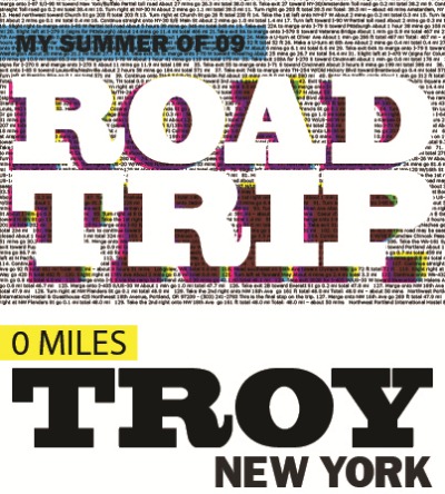
roadtrip comp third draft color 2

view full size on flickr

Typographic storyline of a roadtrip I went on in the summer of 2009. Photoblogged here and again here.

Created in Adobe Illustrator CS5. View full sized on flickr!

“selling out”

Well, not really. But sort of.

I’m a Learning Assistant for freshmen residents in the dorms that I live in this year. I put on 5 workshops a semester based around academics with packets of information as takeaway. I create many posters and door tags to advertise for these events, as well as other college and study tip related handout materials for rounds that I complete a few times a week.

Because of this, I spend hours at a time pouring through tons of free font sites (dafont.com I’m looking at you) looking for the best flame-themed font for my pizza and wings study skills session (hint: there isn’t one). I take the decision of neon orange or hot pink paper choice for packets very seriously – will pink be too girly? Will orange burn everyone’s eyes out? Does it matter that I used orange on my last flier and there are 3 more of that color on the bulletin board right now? What’s left in the supply closet?

These are the serious design questions I face every day.

While I think it’s (always) super important to focus on design quality in everything I do, I also understand the limitations of design and the audiences I am responsible for. I love spending time typesetting my posters and fliers and creating type hierarchy in my packets. But in the end, it comes down to a fine balance of design and content (not to mention time). My students attend my programs in order to learn the most they can about the transition from high school to college academics – and for the free food, naturally. They are largely engineering or science students. They can’t tell Times New Roman from Georgia and frankly, they probably think Comic Sans is the perfect font choice for anything other than essays.

So while I could probably spend minimal time and effort on my materials, I still choose not to. I certainly don’t spend the same amount of time on (most of) these that I would on my Information Design or Advanced Typography comps – but occasionally I’ll come close. This is where I start thinking about the notion of selling out, or whatever term is appropriate here.

As designers, how much should we play to our audience? When do we decide enough is enough, or minimal effort will slide us by? If we can spend less time on a project, should we? These questions are especially relevant for students, in my opinion.

At the moment, I am not working as a freelance designer, so of course the answer for me is not as economically driven as it may be for those who are. Freelancing artists definitely have another angle to consider – time is money and money is time. I’d like to believe (and think it’s true!) that this is also tempered with a good amount of design consideration, but sometimes a project or project leg has to just be declared done in order to move on and continue your livelihood.

As a full-time student, the answer is a little less clear at times. I am certainly not getting paid monetarily for the work I do, and frankly it’s not even necessary that I “design” my materials for activities outside of classes. But if you follow this train of thought, the fact that I’m a student is even more important than nonpayment – I am paying for an education in this field of study. Shouldn’t I take every opportunity to exercise and train myself in this field? Even if it requires more time on my end, don’t I want to be proud of what I am producing?

It definitely doesn’t hurt to be known as “the EMAC*” who designs all of her materials. In fact, it’s quite flattering. However, it’s a bit like comparing apples to oranges – the other students in my position are not design students and thus don’t face these questions. And in the end, this fact means that designing my materials doesn’t necessarily teach me more or push me about design. But it does make me more aware of the materials I’m producing in “everyday” life, in addition to my design work.

I can’t be the only one who experiences this dichotomy. I’ve often faced the same problem with presentations for classes, fliers for clubs, and report covers. I think it’s enhanced because I am a dual major in arts and not-arts at a primarily engineering school where form is rarely thought about and function rules all. Switching between the two schools of thought can be exhausting and tends to lead me into a haze of perfectionism where no final product is satisfactory to me. It can be frustrating to see the importance of design aesthetics where many don’t see or appreciate the purpose in print design, and that line that we must balance as students occasionally becomes frighteningly hard to see.

Have you ever experienced this as a design student or professional? What about as a non-design student? How do you deal with it, in either situation?

*EMAC = Electronic Media, Arts, and Communications – the graphic arts major at my school. I am concentrating in Graphic Design.

Friday, February 12, 2010

odds and ends

pretty things:

  • Rebecca Thuss's illustration portfolio – I love the elegant, clean design of this site! It has just enough character to make it unique, but it isn’t overwhelming.
  • Decor8’s mugs and books photo post. Gorgeous. Makes me feel all cozy and wintry.
  • Daytum. Cute personal graphing site, love the infographics.

DSC07016Have a lovely day!! Views brought to you courtesy of Portugal…can’t believe it’s already been so long since studying abroad!

Saturday, January 31, 2009

logo design

I found this great link about the process behind creating a corporate logo the other day.  David Dache talks about the process behind redesigning HotBox Studio's logo here (via swissmiss - ironically enough, I found this link about an hour before my Graphic Design for Corporate ID professor sent it out to our class list). 

I really love the breakdown of the process behind creating this logo - especially the part about going back to sketching instead of working right from the computer.  This semester is the first almost completely graphic-design oriented semester I've ever had (!!), and I've really rediscovered the merit of constantly sketching and working on paper during rough drafts.

Currently, I'm doing a lot of logo work in classes, and I've just gotten my first freelance job through a class I'm taking!  I've applied to get research credit (or a stipend if I'm lucky) through the school for this job, since I was referred by a professor.  A former staff member of the school I'm at recently opened a consignment shop in downtown Albany, and needs an identity for his store.  So I'm sure I'll be posting more about my process and what's up with that!

If you ever get a chance, check out Paul Rand's book Design Form and Chaos.  It's currently out of print, which is a shame because that means two things: it's really hard to find, and it is ridiculously expensive if you do find it.  My professor for the above mentioned class actually assigned a reading to us from it that really laid out the process of logo design, which was an excellent read.  I'll see if I can possibly upload that in the future (not sure about the copyright issue, I'll have to look into that).  But I had also heard of this book through another professor during freshman year, and really want to find it!

Some other useful links for logo design and the process behind it:

I think that's all for now...night!

Thursday, January 22, 2009

class: my logo project

I'm taking Graphic Design for Corporate ID this semester, and I am in LOVE with it!  Good thing, too, because it's an 8am class...ouch.  It's also my first 8am class (ha!), but I have to say I honestly don't mind waking up so early once I get to class.  It makes me sad, even, that I have another class after it, because I leave feeling so inspired that all I want to do is design!

I haven't taken any graphic-design heavy courses in awhile, which is another reason why this course energizes me so much.  I was on the animation track for my major for awhile, until I realized that it bores me and I'm just not in love with that stuff.

For the past 2 weeks we've been working on logos for ourselves.  The initial sketch-up was for 25 logos based on our initials, 25 based on our full name (in one form or another), and 25 logos based on a graphic.  From there, we had to pare it down to 3 logos from each category and clean them up on the computer.

Here are my 9:

image

image

image

image

Variations.........

image

I'm pretty stoked that the professor liked them!  I haven't felt very validated as an artist in a long time (anything involving Premiere or AfterEffects tends to do that to me..........), so it was great to hear the feedback on this.

Based on the first set of comments I got on the initial sketches, my own thoughts, and what I heard today, I really like the graphics set (all of them, ahh decisions...).  I'd like to do more with the hand, and replace the word "lefty" with "natalie", or my last name or initials.  "Lefty" just isn't personal enough, but I like the styling, so it's a good representation of what it will most likely end up looking like.

I love the line-style writing in the set with initials (obviously!).

As for the full name logos, I had the most fun with the letter stacking, and I really like the bottom version.  I might play with the variations on that and see what I can come up with there.

I'd love to know what 1 from each category are your favorites! 

Thursday, January 15, 2009

a good mug is hard to find

I've always had a thing for well-designed mugs - I love picturing myself enjoying a cup of coffee or good tea from it.  Here are a few I've been loving lately:

mug

Bodum French Press Travel Mug, $10 at Bed Bath & Beyond

 mug2 pridepred

Penguin Classics Mugs

orlakielymugOrla Kiely designed mug

pantonemug3 

Pantone chip mug (Did you know?  The guy who invented this system graduated from RPI!)

imageimage

Boulder Mug, $10 at Urban Outfitters

imageimage CMYK mug and Everything Happens for a Reason mug, from CafePress

 image I <3 Jim mug, $8 at Urban Outfitters

image Tea cup, $14 at Anthropologie

image Tea cup, $16 at Anthropologie