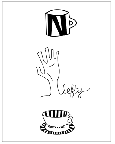
I'm taking Graphic Design for Corporate ID this semester, and I am in LOVE with it! Good thing, too, because it's an 8am class...ouch. It's also my first 8am class (ha!), but I have to say I honestly don't mind waking up so early once I get to class. It makes me sad, even, that I have another class after it, because I leave feeling so inspired that all I want to do is design!
I haven't taken any graphic-design heavy courses in awhile, which is another reason why this course energizes me so much. I was on the animation track for my major for awhile, until I realized that it bores me and I'm just not in love with that stuff.
For the past 2 weeks we've been working on logos for ourselves. The initial sketch-up was for 25 logos based on our initials, 25 based on our full name (in one form or another), and 25 logos based on a graphic. From there, we had to pare it down to 3 logos from each category and clean them up on the computer.
Here are my 9:
Variations.........
I'm pretty stoked that the professor liked them! I haven't felt very validated as an artist in a long time (anything involving Premiere or AfterEffects tends to do that to me..........), so it was great to hear the feedback on this.
Based on the first set of comments I got on the initial sketches, my own thoughts, and what I heard today, I really like the graphics set (all of them, ahh decisions...). I'd like to do more with the hand, and replace the word "lefty" with "natalie", or my last name or initials. "Lefty" just isn't personal enough, but I like the styling, so it's a good representation of what it will most likely end up looking like.
I love the line-style writing in the set with initials (obviously!).
As for the full name logos, I had the most fun with the letter stacking, and I really like the bottom version. I might play with the variations on that and see what I can come up with there.
I'd love to know what 1 from each category are your favorites!


2 comments:
love these! My favs are the hand ( and I like your idea of making it a little more personal with your name or something), the skinny line NS in the middle in the initials category, and the Natalie with the tilted "I." But they are all great! The coffee cups are adorable!
I am a big fan of the signature, though I also like the block with the S in it. I think the signature looking one give more information, which I like. One that I don't particularly care for is the
N
ata
lie
because it feels like it emphasize the "lie" at the end, which I don't think is the impression you are trying to give. All in all though, very nice!
Post a Comment